 At their recent Global BI Summit, market research firm Gartner presented their vision of “Analytics and the Office of Finance” and introduced the concept of Strategic Performance Reporting. As the next level of analytics and reporting, Strategic Performance Reporting replaces the traditional monthly snapshot P&L and Balance Sheet package with a collaborative environment where Finance works together with functional business groups to understand and present the story behind the results. It contains meaningful visualizations and analytic drill-down. In order to tell the story of performance, reports include operational detail and narratives that explain what happened.
In this article I would like to introduce CXO-Cockpit, software designed around the concept of Strategic Performance Reporting. We will zoom into the three key areas of Strategic Performance Reporting: storytelling, collaboration, and relevant visualizations.
Telling the Story of Performance
“Storytelling” is a lot more than distributing your monthly financial statements with some footnotes. It is supposed to be interactive and should contain input from different operational departments. A story of performance compares business performance with the long or short term strategy using visualisations that emphasise outliers. It contains no large row and column reports without variances, or meaningless pie charts or bar charts.
CXO-Cockpit approaches storytelling with a three step method:
- Choose the right reports to tell the story, enrich them with operational detail and meaningful narratives containing background information and explanations
- Put the reports in the right order so a logical story of performance is created
- Share the story with the company stakeholders in a simple and intuitive way
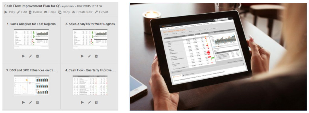
A practical example of storytelling is the Q3 Cash Flow Improvement Plan as shown in the image below. This Storyboard first zooms into sales details for the two operating regions, then presents a dashboard that analyzes the Days Sales Outstanding (DSO) and Days Payable Outstanding (DPO) per region to understand cash conversion. Finally, it concludes with a report showing a full cash flow overview together with an improvement plan in the commentary field.
Instead of just being aware of the fact that the company is facing a problematic cash flow position, stakeholders now understand the background and can read the plan for improvement.
The stakeholder receives the story in an app on his tablet and reads through the story as if it was a Wall Street Journal article, while still having all analytic capabilities like drill-down and slice-and-dice.
Collaborative Reporting
Reporting is a process that should involve more than just the Finance department. Strategic Performance Reporting gives insight to enterprise performance by including details from operations and narratives from the business.
The example below shows the current month corporate P&L compared to last year. To give more insight into sales performance it includes a detailed product breakdown from the company’s CRM system. Users can drill down to the individual products per operating entity and the system shows a small reconciliation difference to keep the report accurate from an accounting point of view.
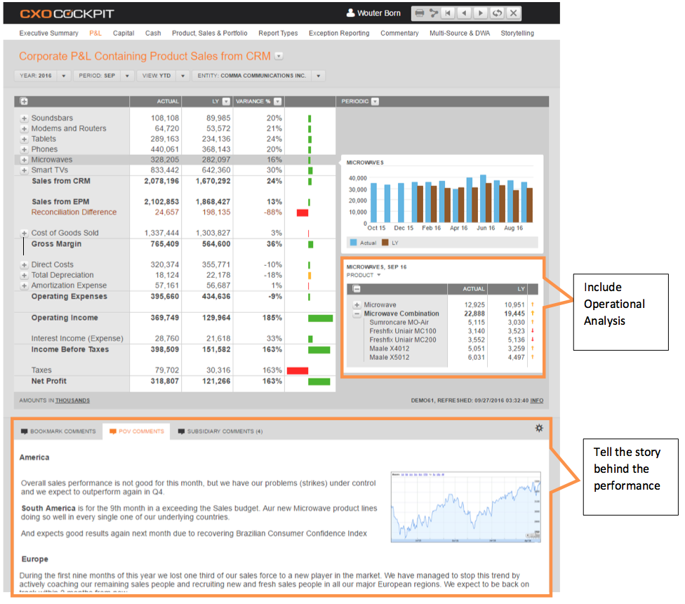 In the commentary field the individual Finance and product managers have entered their explanations. CXO-Cockpit enables rollup of the regional business explanations to report a consolidated story of performance.
Using Relevant Visualizations
The use of charts can be a great way to tell an effective story of performance, if done properly. With CXO-Cockpit we strive to use the most relevant visualizations that promote understanding of results by following these rules:
Focus on variances: Compare the actual results to strategic targets, and use consistent colors for positive and negative variances.
Emphasize outliers: The benefit of showing hundreds of products that have achieved expected results is minimal, but highlighting exceptions and outliers will draw attention to problems and opportunities.
Visualize what contributes to the story: The example chart series below shows sales variances by region, as part of a story about how the unexpected Brexit decision negatively impacted Europe’s total results.
| The first chart shows how the Europe region under-performed as a whole. | 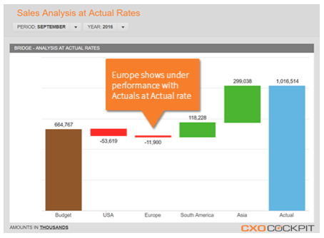
|
| Meanwhile the second chart removes the effect of foreign exchange impact to show that in fact Europe has out-performed. | 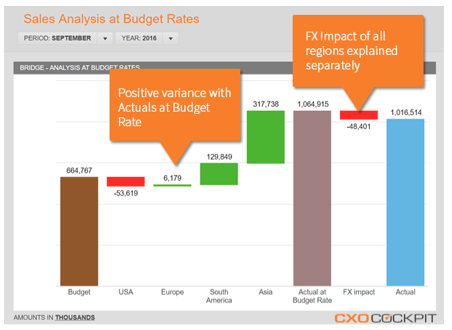
|
| In the third chart we see the results by country, and it becomes clear that the drop in the GB Pound vs. the US Dollar was the major reason for the region’s results to turn negative. | 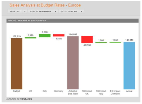
|
Strategic Performance Reporting combines collaboration, meaningful drillable visualizations, and narration to tell a clear story about the reasons behind business performance. CXO-Cockpit is a tool that provides these features, enabling you to achieve the next level of performance reporting and drive business transformation.
Watch a Product Demo of CXO-Cockpit
If you’d like to know more about CXO-Cockpit, please watch our recent webcast where Wouter gives a full product demonstration and highlights even more of the available features. Click here to register with CXO-Cockpit to watch the recording of the full webcast.
About the Author
Wouter Born is Chief Technology Officer and co-founder of CXO-Cockpit. With over 15 years of consulting and software experience across Oracle Hyperion, SAP and Microsoft platforms, Wouter is responsible for CXO-Cockpit’s product innovation strategy and execution, ensuring CXO continues to deliver high value, finance-driven functionality.